A template is just another way to render the same data. Bookmarks, groups, nav packs, card toggles and integration settings live on the server in one place; switching templates only changes how they are arranged, so nothing can "disappear" when you switch.
Effective immediately — no restart, no re-login
Your choice is remembered across refreshes, tabs and days
All four templates use the same aggregated search, nav packs, toolbox and cards
On a Pro instance the admin can push one template as the default for everyone (see below)
Diagram: the data lives once; the four templates are four arrangements of it.
A fifth template (Bento) is still being polished and is not switchable in this release — not seeing it in Settings is expected.
The four templates at a glance
Pick by how you want it to look, not by features — all four expose the same feature set; they differ in information density and habits.
Template
In one line
Best for
Price
Classic
Category rail plus card grid and site list; drag to reorder, free 1-3 span resizing
A main browser home page that must hold a lot
Free
Magazine
Large cover cards with summary waterfall, browsing first
Many services on one NAS, managing from a single page
Pro
Desktop
Windowed desktop: draggable resizable windows plus a Dock, one integration per window
Desktop-style workflow with separate windows per service
Pro
A template is not a skin. Console and Desktop own their visual language and therefore take over background and card styles (see "Beyond the template").
The four templates, screenshotted
All four shots are from the same device on the same data — only the template changes. Host-specific details such as IP addresses and the machine name are blurred.
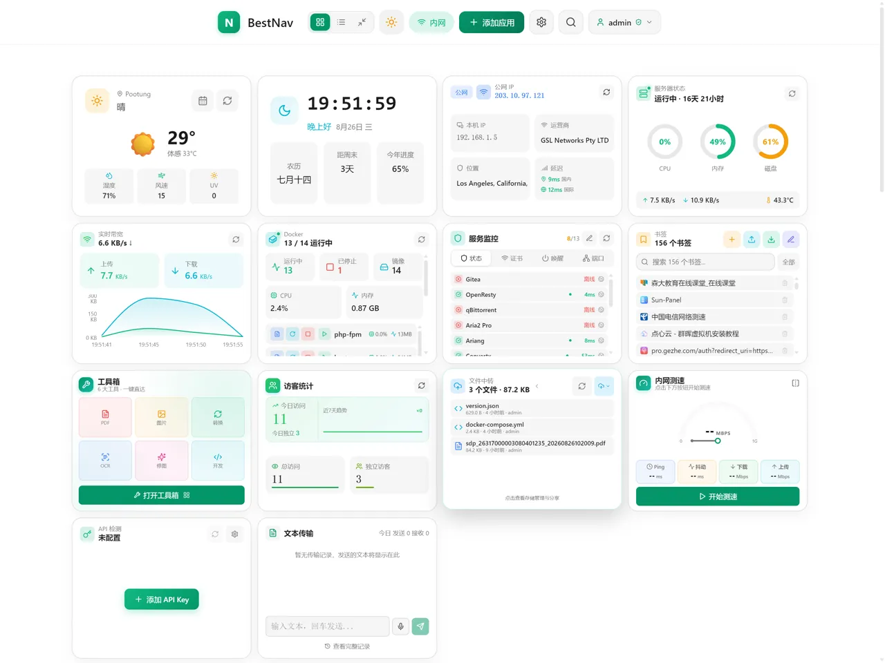
Classic: category rail plus a card grid — the densest layout, with free dragging and resizing.
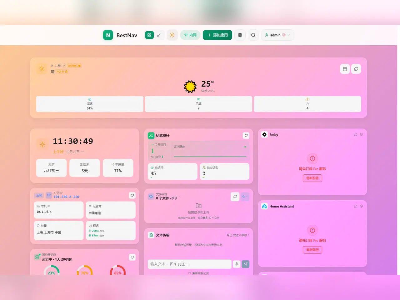
Magazine: cover cards and a summary waterfall, treating bookmarks as content — free to use.
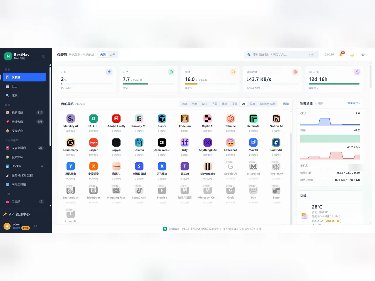
Console: side-rail admin desk with KPIs across the top (CPU, memory, storage, throughput, uptime), live resources on the right and grouped navigation in the middle.
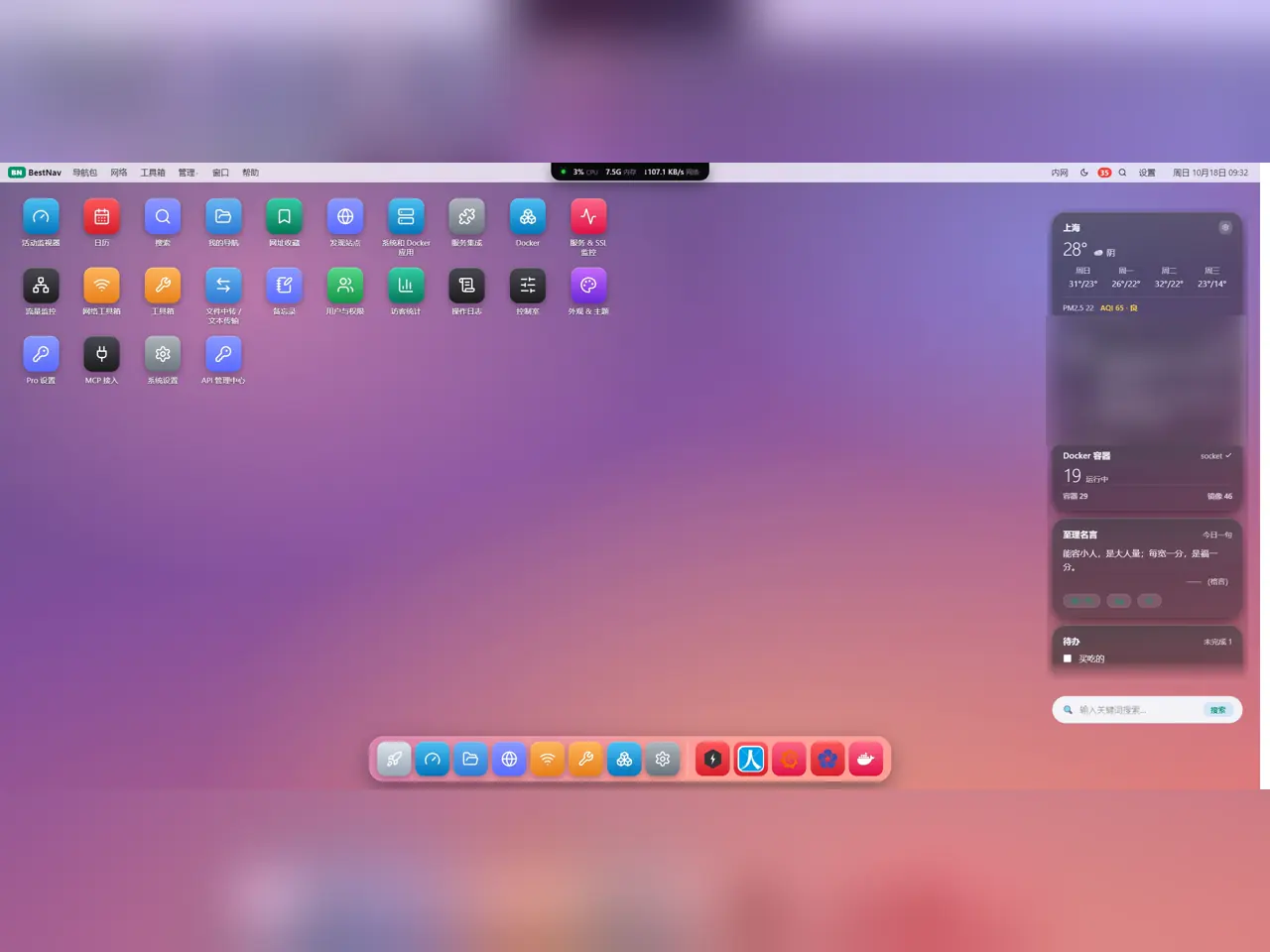
Desktop: desktop icons, a Dock and an info-card column on the right; every integration opens as its own native window.
What each template is good at
Classic: all nine card sizes are meaningful (the grid really honours column and row spans); signed-out visitors can see public cards such as weather, clock and public navigation.
Magazine: cover-card waterfall with three row-height steps; keeps public cards and the shared bottom nav on mobile.
Console: KPI overview (CPU, memory, storage, throughput, uptime, temperature) plus grouped side views; all 17 integrations (fnOS Video / Photos / Music included) are native sub-pages of this shell, not embedded web views; top-bar search or Ctrl/Cmd + K opens the full-page aggregated search.
Desktop: every integration is its own desktop icon and native window, resizable and draggable; the Dock supports pinning; in-window music playback, TeslaMate location map, Gitea commits and source tabs.
Both management templates also expose the Control Room — a switch wall for frequent operations (see the Control Room guide).
How to switch, and who follows
Go to Settings → Appearance → UI Templates and click a card; the active one is marked "In use". Classic and Magazine are free to switch; Console and Desktop carry a Pro badge.
Ordinary users: the switch affects only your own account and is remembered per account
Admins on a Pro instance: switching a card also sets it as the default for everyone — users who never chose one and people on a new device land there; signed-out visitors get the same default
Admins can additionally lock everyone: all users (admin included) are forced onto the default and the switch entry is frozen
Want everyone on their own layout: set a default but skip the lock — once a member picks one, their choice wins
Diagram: how the template is decided on each open — the lock first, then your own choice.
Since 2.0.0 every template card ships with real screenshots: tap the 🔍 on a card to flip through how that template actually looks (several shots per template, one per page) without switching to it first.
What is free, what is Pro
Free: Classic and Magazine — switchable without a subscription, full base feature set
Pro: Console and Desktop, plus the per-instance default and lock-for-everyone management
Switching itself never costs extra: once Pro is active all four templates are yours, not priced per template
If an admin on a non-Pro instance selects Console or Desktop, members still fall back to an available template — no blank screen.
Beyond the template: appearance settings
Theme, background, card style and accent colour live in Settings → Appearance and are separate from the template: the theme is shared everywhere, the background is stored per template.
Light / dark theme, manually or following the system
Custom background image; Pro adds blur and dimming so cards stay readable
Nine card style presets with a custom colour panel (Pro)
Three-state icon handling: brand icons are placed flat, matted or tiled based on their backdrop, readable in both themes
Footer filing numbers: ICP and public-security numbers configurable in the admin panel, shown on every template and the login page (free)
Some appearance options hide themselves in Console and Desktop — those templates own a fixed visual language, so unusable controls disappear rather than breaking. Switch back to Classic or Magazine to see them again.
Phones and narrow screens
All four templates can be switched and used on a phone, but the management and desktop templates drop their window and side-rail model on narrow screens in favour of a shared mobile layout.
Classic and Magazine: shared bottom navigation, single-column card flow
Console and Desktop: no side rail or windows on narrow screens; integration window content becomes sub-pages
Top-bar entries compress or collapse on small widths, with enlarged touch targets
Want a phone-only layout: combine the admin default with per-user choices to keep desktop and mobile apart